Back to portfolio
Testimonials
What people say
A few words from people I've worked with.
Featured
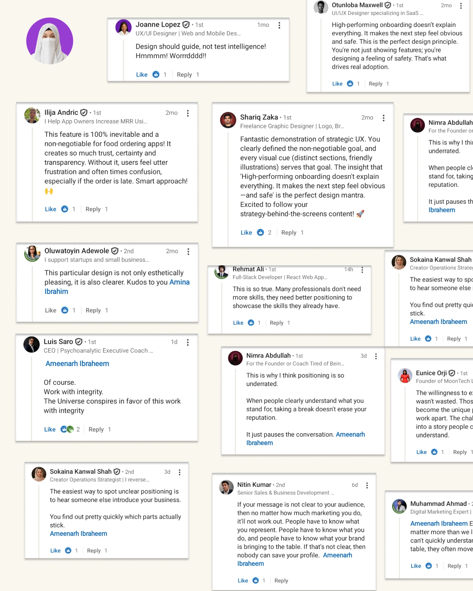
Fantastic demonstration of strategic UX. You clearly defined the non-negotiable goal, and every visual cue (distinct sections, friendly illustrations) serves that goal. The insight that 'High-performing onboarding doesn't explain everything. It makes the next step feel obvious—and safe' is the perfect design mantra. Excited to follow your strategy-behind-the-screens content! 🚀
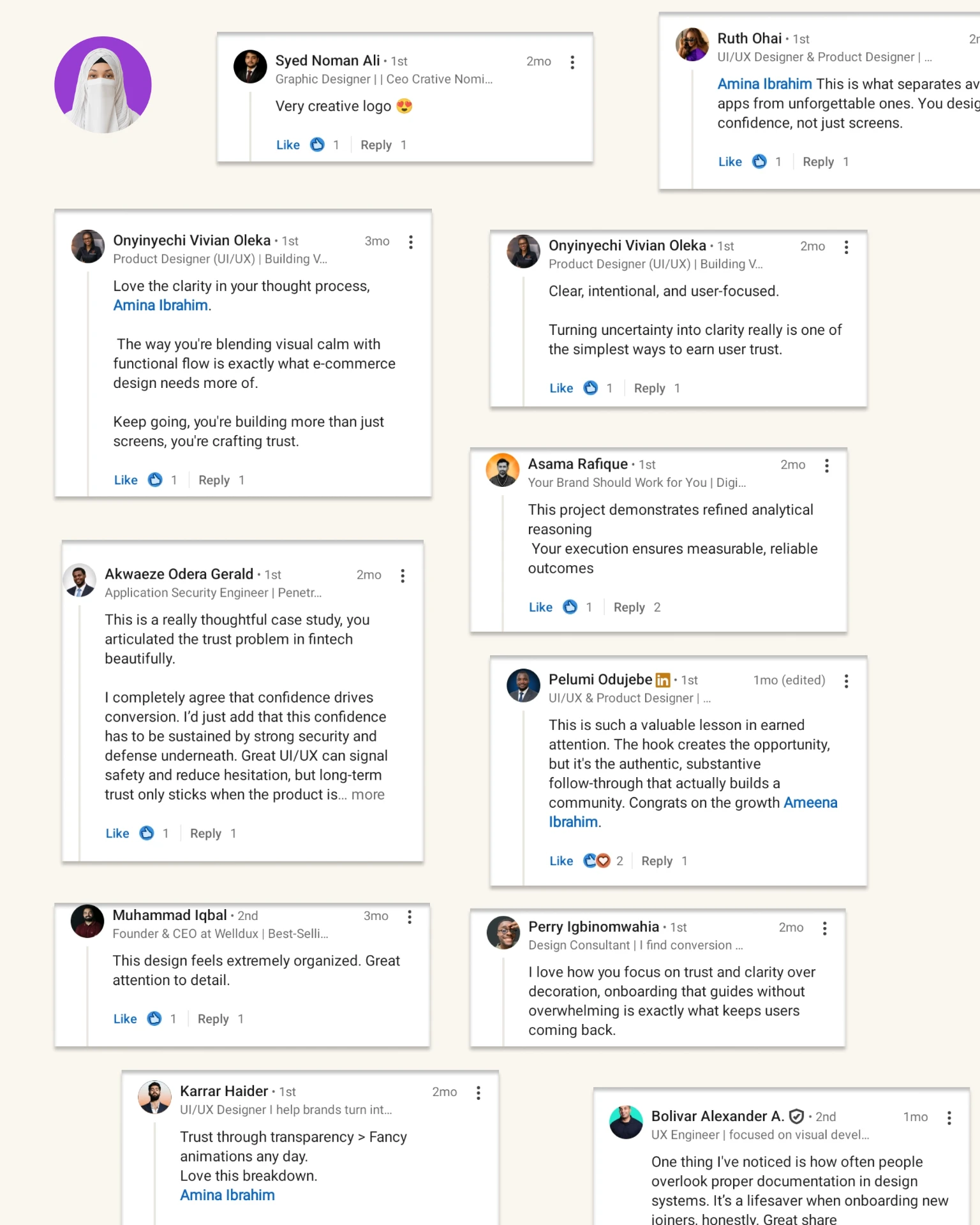
This is a really thoughtful case study, you articulated the trust problem in fintech beautifully. I completely agree that confidence drives conversion. I'd just add that this confidence has to be sustained by strong security and defense underneath. Great UI/UX can signal safety and reduce hesitation, but long-term trust only sticks when the product is…
Love the clarity in your thought process. The way you're blending visual calm with functional flow is exactly what e-commerce design needs more of. Keep going, you're building more than just screens, you're crafting trust.
High-performing onboarding doesn't explain everything. It makes the next step feel obvious and safe. This is the perfect design principle. You're not just showing features; you're designing a feeling of safety. That's what drives real adoption.
This is such a valuable lesson in earned attention. The hook creates the opportunity, but it's the authentic, substantive follow-through that actually builds a community. Congrats on the growth
In their own words
This is what separates average apps from unforgettable ones. You design confidence, not just screens.
I love how you focus on trust and clarity over decoration, onboarding that guides without overwhelming is exactly what keeps users coming back.
This design feels extremely organized. Great attention to detail.
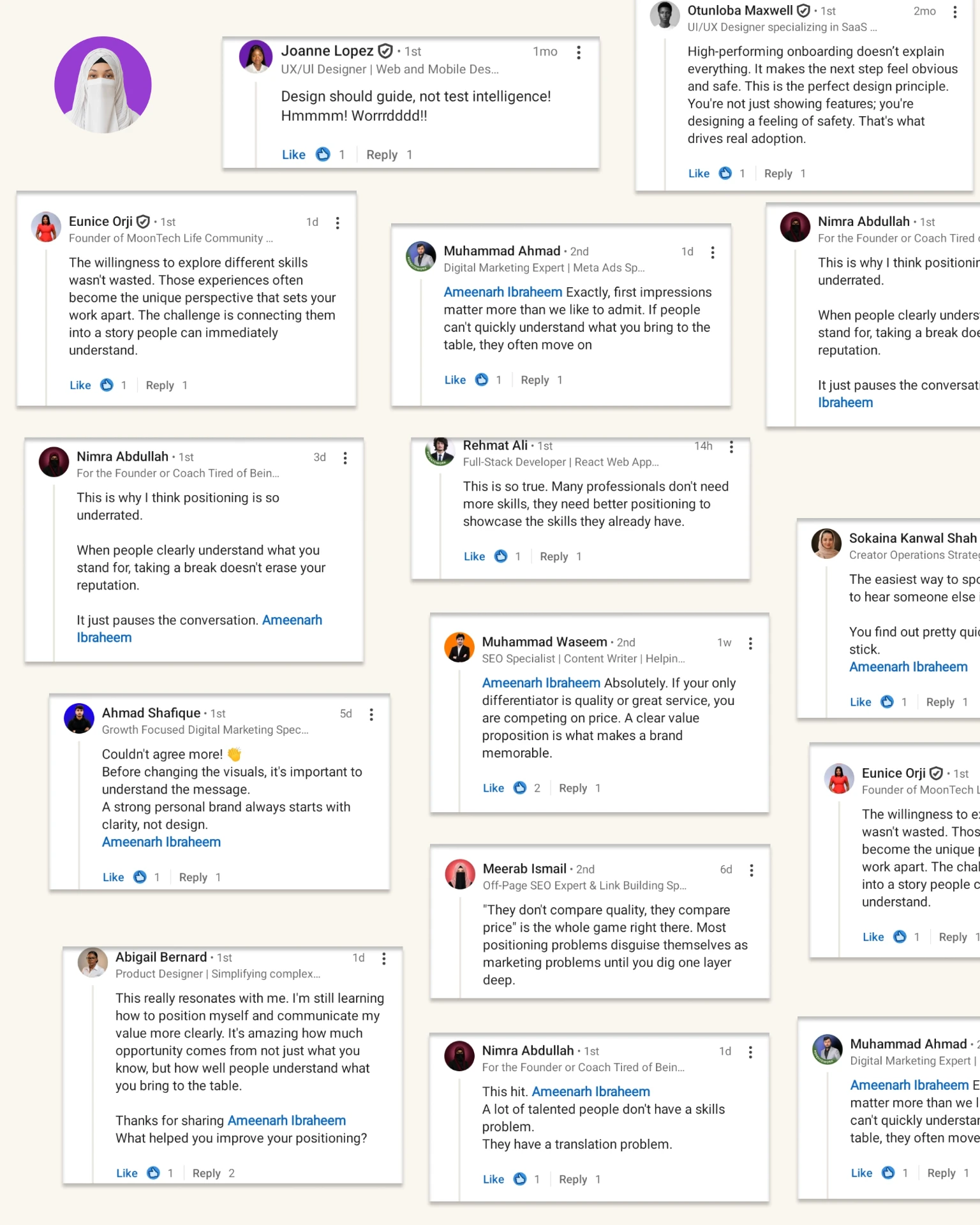
The willingness to explore different skills wasn't wasted. Those experiences often become the unique perspective that sets your work apart. The challenge is connecting them into a story people can immediately understand.
Couldn't agree more! 👏 Before changing the visuals, it's important to understand the message. A strong personal brand always starts with clarity, not design.
The easiest way to spot unclear positioning is to hear someone else introduce your business. You find out pretty quickly which parts actually stick.
This hit. A lot of talented people don't have a skills problem. They have a translation problem.
Of course. Work with integrity. The Universe conspires in favor of this work with integrity
Design should guide, not test intelligence! Hmmmm! Worrrdddd!!
Trust through transparency > Fancy animations any day. Love this breakdown.
This particular design is not only esthetically pleasing, it is also clearer. Kudos to you
If your message is not clear to your audience, then no matter how much marketing you do, it'll not work out. People have to know what you represent. People have to know what you do, and people have to know what your brand is bringing to the table. If that's not clear, then nobody can save your profile.
Absolutely. If your only differentiator is quality or great service, you are competing on price. A clear value proposition is what makes a brand memorable.
This really resonates with me. I'm still learning how to position myself and communicate my value more clearly. It's amazing how much opportunity comes from not just what you know, but how well people understand what you bring to the table. Thanks for sharing. What helped you improve your positioning?
Very creative logo 😍
One thing I've noticed is how often people overlook proper documentation in design systems. It's a lifesaver when onboarding new joiners, honestly. Great share
This feature is 100% inevitable and a non-negotiable for food ordering apps! It creates so much trust, certainty and transparency. Without it, users feel utter frustration and often times confusion, especially if the order is late. Smart approach! 🙌
Clear, intentional, and user-focused. Turning uncertainty into clarity really is one of the simplest ways to earn user trust.
This is why I think positioning is so underrated. When people clearly understand what you stand for, taking a break doesn't erase your reputation. It just pauses the conversation.
This is so true. Many professionals don't need more skills, they need better positioning to showcase the skills they already have.
"They don't compare quality, they compare price" is the whole game right there. Most positioning problems disguise themselves as marketing problems until you dig one layer deep.
Exactly, first impressions matter more than we like to admit. If people can't quickly understand what you bring to the table, they often move on
This project demonstrates refined analytical reasoning. Your execution ensures measurable, reliable outcomes
Straight from the source
Unedited screenshots of the conversations these words came from.